Wednesday, April 28, 2010

Updated Thesis

His work with RayGun Magazine, his collaboration with Lewis Blackwell to create The End Of Print, and his self-taught style of typography, has helped reinforce David Carson's title of "Art Director of the Era", by London based Creative Review


A very wise person once said "Be who you want to be". In life, people search to find that one job or aspect of their life that defines them and make them happy in life. Some are lucky and find it early in life while others take years to sift through their minds, trying to figure out who they are and what makes them happy. David Carson is one of those people. David Carson is one of the most renown graphic designer/typographers in the world. Yet, he did not start out that way. If one graduated college with a degree in sociology, one would expect to work in said field. But not Carson. He always had a passion for the arts, graphic design, and typography. From there, he went on to create some of the most interesting and respected pieces of work. His work with RayGun Magazine, his collaboration with Lewis Blackwell to create The End Of Print, and his uneducated style of typography, has helped reinforce David Carson's title of "Art Director of the Era", by London based Creative Review


making an impression and making it my own

Wednesday, April 21, 2010

David Carson- LOOSE Thesis

Because of David Carson's revolutionary typography, his acute sense of design, and his overall view of graphic design, he can easily be one of the most influential graphic designers of the 20th century.

Wednesday, April 14, 2010

After Class 4/14

In today's wonderful class, we entered the world of Corporate Identity Systems. This era of design began to boom during the 1950s and is still a crucial aspect of businesses today. It all began with Peter Behrens at AEG (considered to be the first full identity system) and Olivette Corporation creating logos/identity systems for the public to associate both of their companies to. By doing this recognition of the company shot up to large numbers. One of the most recognizable logos in today's world that has lasted since the beginning is CBS (The Colombia Broadcasting Station). CBS's logo, which is still in existence today is a large eye. Simple, yet "eye catching". It was because of these people and companies that logos became a very important, if not most important, part of a business' identity to the public.


Question: Why is CBS's eye still used today? What about the eye has made it so likeable and useable today? Some logos have changed over years, but the CBS eye hasn't changed that much. Why not?

Before Class 4/14

For today's class, we wrapped our brains around the idea of the Corporate identity system. "Good design is good business" was the war cry for most businesses during the 1950s (Meggs Pg. 399). The idea that every business needs some sort of logo/way to identify themselves to the mass population. Thus Peter Behrens, with AEG (who I already talked about both on here and in my graphic notes =D) and the Olivetti Corporation. Adriano Olivetti (1901-1970), owner of the company, hired Giovanni Pintori (1912-1998) to his publicity department at the ripe old age of 24 (Meggs Pg. 399). For the rest of his career at OC, he created a logo/identity system that would help begin (along with Behrens atAEG) the boom in logo and identity development that would forever change the face of businesses in the eye of the public

Tuesday, April 13, 2010

After Class 4/13

In today's class, we went over the New York School and the style of the mid to late 20th century. The style began with Paul Rand's style of design that was a reduced form of "symbolic essence" (Meggs Pg. 374). He was an editorial designer that felt that design should upgrade taste in the everyday world. Another influential graphic designer was Alvin Lustig. Lustig was a graphic designer who also dabbled in architecture and interior design. He thought that form and content should be one when it came to his graphic design. When it came to the actual New York School, the ideas behind it came from the 1st ever graphic design program to be established at a large school. The Yale School Of Art, still one of the most prestigious institutions in the country, became a leader in the education of graphic design. By hiring multiple well known graphic designers, Yale became the leader in the education of not only graphic design but also the arts. Later on, the New York School of design grew from the Yale School of Art's design and created a style of graphic design that is still used today.


Question: How and why is Yale such a leader in graphic design in the U.S. today? There are so many accredited schools out there that have been leaders in the design world. But why is Yale?

Monday, April 12, 2010

Before Class 4/12

For today's class, we read about the New York School and the evolution of graphic and typographical design in America, during the 20th century. It all started and gained steam from the works of Paul Rand. Paul Rand understood that freely invented shapes could have a self contained life, both sumbolic and expressive, as a visual-communication tool (Meggs Pg. 374). What that means is that Rand's work could get the message across to the viewer either symbolically( literal) or expressively (free-form). From there Paul Rand's designs helped revolutionize mid to late 20th century design. From there, Alvin Lustig contributed his unique style of graphic design by combining east and west coast influences into his work

Friday, April 9, 2010

Before Class 4/9

For today's class, we went head on into the International Typographical Style. The International Typographical Style that originated in Switzerland during the late 1940's through the 1950s. It began with Theo Ballmer

Thursday, April 8, 2010

After Class 4/7

In today's class, we learned about American Kitsch. Personally, I kinda like American Kitsch (German for "in bad taste") and the era behind it. To me, it's always going to be viewed as "50's Style" and/or "retro style". It reminds me of the 50's when poodle skirts, Looney Toons, Big Boy, and drive-ins. Almost of back home with Detroit, old classic cars, and most importantly, the Woodward Dream Cruise in Detroit. It is an annual celebration of the golden age of cars, style, music, and everything else that can be linked to the 50's. If you grew up in the Metro-Detroit Area at all, the Dream Cruise is a big deal. And American Kitsch reminds me of it every time I see any form of it. From typography to images, it will forever be ingrained into my head as a part of my life even though it was over 60 years ago.

Question: Why, if it was such "bad taste", is American Kitsch so beloved and remembered? Will it always be remembered after the people of that generation are gone??

Wednesday, March 31, 2010

After Class 3/31

Today in class, we got to know a little more about my personal favorite movement in design; Art Deco. Art Deco was a movement that was supposed to be fully brought to light in 1925 at Paris' Exposition of Art and Architecture. Fortunately, it was not opened to the public but it slowly evolved as the years went on. Between 1920's through the 1930's, Art Deco thrived as a new, awe-inspiring design that is still used today. Its use of bold color and pastel color along with more geometric designs with little detail. "Less Is More" was the main slogan during the time. When it came to the typography of the movement, the use of bold, fat lines sprinkled with thin lines to accent letters created a new font that can be easily viewed as "Broadway" style. Overall, the design, color, architecture, and typography of Art Deco just speaks to my eye and my feelings about design, thus making it my favorite movement in design history.


Question: What is it about Art Deco that still keeps many, including myself, interested today?? And why did Disney's MGM Studio's create an Art Deco city within the park?? Some great food for thought in my eyes =D

2134927064_fce439c63e.jpg

Tuesday, March 30, 2010

After Class 3/29

In today's class, Joslyn presented to us the Bauhaus movement. The Bauhaus movement started as the Weiner Arts and Crafts School directed by Henri van de Velde. Then after WWI, Walter Groupius took over the helm and attempted to unify artist and craftsman to industry. The Bauhaus School was in Weiner from 1919-1942 where expressionism, De Stijl, and Constructivism were in full effect. Then from 1925-1933, Bauhaus moved to Dessau, where it was renamed Hochschule fur Gestatlung.


Question: If Bauhaus did not move from its original location, do you think it would be what it is today?

Wednesday, March 24, 2010

Before Class 3/24

For today's reading, we delved into the world of Pictorial Modernism. A new and up and coming style of art that dealt with posters helped revolutionize what we see today. Here are the points that caught my eye from the reading:

Pictorial Modernism
-Beggarstaffs (James Pryde [1866-1941] and William Nicholson [1872-1949]) created the technique of "collaging" by taking letters, words, and images and gluing them to a flat plane to create a one dimensional plane of color.
-Collages were viewed as "drawn with scissors"
-Unfortunately, they brought in very few clients, printed even less, and basically went bankrupt.

Plakastil
-It was a German, flat-color design school
-Lucian Bernhard, the creator of the Priester match advertisement, created the ad after reducing the original image to just two matches and the name Priester
-Bernhard is considered the graphic artist who helped develop poster art as a whole
-Bernhard formula: flat background color; larger, simple image; and product name.
-His work pioneered the simplistic movement

Switzerland and the Sach plakat
- Basel Realism well promoted by Niklaus Stoecklin (1896-1982), Otto Baumberger (1889-1961) and later on Herbert Leupin (1914-1999)
- Their Sachplakate (object posters) were characterized by simple, laconic, and sometimes hyper-realism approach (Meggs Pg 274).


The Poster Goes To War
-Posters hit their importance height in WWI with propaganda posters
-The posters ranged from promoting money drives to smear campaigns against the enemy countries
-There were distinct differences between the poster designs of the Central Powers and the Allied Forces
- The Central Powers' posters still had traces of the Vienna Secession and Plakistil by Bernhard.
- The Allied Forces had more illustrations, using literal rather symbolic imagery to address propaganda objectives (Meggs Pgs 275)

Food For Thought: Was the reason that Allied posters were so different from Central Powers not only the war, but was it also a war of imagery (who made better posters)?

Monday, March 22, 2010

Before Class 3/22

For this beautiful day, we had to open the book, dust it off a bit, and read about the influence of modern art (chapter 13). Here are the main points I got out of the reading:

Cubism:
-Pablo Picasso began the movement with a series of works that "applied elements of ancient Iberian and African tribal art to the human figure"(Meggs Pg. 248).
-Cubism brought new ideas and techniques in using different planes of the space of medium.
-Paul Cezanne was another major influence on Cubism because of his "treat nature in terms of the cylinder and the sphere and the cone" ideals.
-Analytical Cubism evolved from the original cubism by using perceptions to help create their works.
- Synthetic Cubism followed

Futurism:
-Created by Italian poet Filippo Marinetti

Saturday, March 20, 2010

After Class 3/19

Yesterday in class, Kevin introduced us to Peter Beherns and the London Underground. I really basically went over what I had learned about him in the previous post. I didnt learn anything really outside of the box or new from his presentation (not in a mean way at all). Thanks for the great Presentation Kevin!!

Friday, March 19, 2010

Before Class 3/19

In the reading, I read about two major aspects of 20th century design:

Peter Berhens:
He was considered the first user of a sans-serif font in a commercialized book
He was considered the first creator of a corporate identity system
He was a pioneer in the use of making identity system for corporate use


London Underground:
1st created by Frank Pick
Still Used Today
1st use of advertisements in the underground stations

Saturday, March 6, 2010

After Class 3/5

In the most grueling classes before spring break (just kidding), we went over the wonderful era of Art Nouveau. In French, Art Nouveau means "New Art". The time period called for a change in not only fine arts, but art and society as a whole. The Art Nouveau movement grew from the Arts and Crafts movement in the not too distant past. The style of Art Nouveau is nicely organic and linear. I am mostly repeating myself from before class blog so I will let the before class blog explain itself a little bit more.

Bri did a very nice job on presenting the information and I did learn a lot from it.

Thanks again Laura for letting us go early!! Hope you enjoy your spring break and see you in a week!!


Wednesday, March 3, 2010

Before Class 3/3

Hmmmm...here is a thought. When the term "arts and crafts" is said, what is the first thing that pops in your head??

"ohhh like making cool little things with paint, fabric, ink, and so on?"

I bet you that is the response many would get when asked about arts and crafts. But the term was used way before our time here in USA. Rather, it was a term to describe a time period of much revival that occurred in England, in the late 19th century. The revival of such was the renaissance
of book design that began with William Morris (1834-96) when he called for a fitness of purpose, truth to the nature of materials and methods of production, and the individual expression by both designer and worker (Meggs, 166).

As I continued on, Morris gained a sidekick who thought his path was also to seminary school. His sidekick went by the name of Edward Burne-Jones. Oddly enough, on a trip to France, they both decided to ditch the seminary school idea and dive into the world of painting and art. Both were influenced by Dante Gabriel Rossetti (1828-82) and began their lives of design.

Philip Webb created one of the most revolutionary architectural designs named Red House

Tuesday, March 2, 2010

After Class 3/1

Today in class, instead of having our normal read and go over what we had learned day, we had a total review of what we have learned so far. I personally needed it because I am still kind of out of it from conference. What we did was we divided up into groups of 3 and were given a stack of images, dealing with a certain aspect of what we had learned so far. My group had images dealing with the typography of our knowledge, starting with the very beginning in the Caves of Lascaux and spanning all the way to moveable type and sans-serif font. It was truly a nice refresher because I feel like I have learned a lot, yet when it comes to specifics, I do struggle a bit. Thankfully, with the new installment of graphic notes, I will be able to remember people, events, typefaces, and designs a lot easier. It was nice to remember the order of pictograms, petroglyphs, and ideograms, along with the types of type–Old style, transitional, modern, and script. I am sure by the end of this semester, those 4 different font styles will be burned into the back of my head. Hey, I don't have a problem with it =D


Question of the day: When it came to different typefaces with the invention of moveable type, how were new typefaces conceived? Like why were there so many variations of the same font?

Wednesday, February 17, 2010

Before Class 2/17

The reading for today's class opened up a brand new section of the book with a bang. And when I mean bang, I mean a wonderful chapter about the Gutenberg Press and moveable type.

The beginnings of movable type spanned back to Europe and early wood block printing. These types of printing would be carved into wood (the image and or letters would be either cut into the wood or cut away from the wood), then would be lathered in ink, then pressed onto the parchment or paper. Early creations made with this method were the first playing cards (originally outlawed due to gambling in nature) and religious image prints. From there, the religious prints soon turned into large block books that little text. Oddly enough, the main focus on the block books were about the Apocalypse. As time went on, the wooden blocks began to be trumped by the innovation of movable text. Oddly enough, Johann Gensfleisch zum Gutenberg was NOT the inventor of movable type. In 1444 The Dutchman Laurens Janszoon Coster of Harlem tinkered with the idea of movable type by carving reusable letters out of wood. Because of this, many believe that the Dutch could rightfully claim that they were the earliest users of moveable type.

When it comes to Gutenberg, he had some drama when dealing with his movable type machine. From partners backstabbing Gutenberg, to lawsuits to lay claim to his invention, Gutenberg's life's work was truly a life altering device, not only for himself, but also the world.


Fact of the reading: The largest book that was created (that I read in the reading) was the Latin Gutenberg Bible that had 12x17 inch pages. That was huge!!!

Sunday, February 14, 2010

2/14- Weekly Image


This week's weekly image comes from an advertisement for a brand of whiskey called "Scot's Honor". The whiskey is primarily sold in Taiwan of all places because the people of Taiwan use whiskey as the drink of choice for celebrations, parties, and achievements.


Describe what it is: Scot's Honor whiskey advertisement.

Describe its function: To convince the consumer that the whiskey is the best whiskey to buy and drink.

Describe where you saw it: unfortunately, I googled for Celtic typography and this came up.


Discuss the style of the design & typography: The overall design is a label design. This means that it is short, sweet, and to the point on what the brand is. In this case, the company is trying to convey the idea that Scot's Honor is a whiskey that has been around since the time of the Scot's, during the medieval times. The type used is based off of the Celtic typography that was used when it first was created. Finally, there are nice flourishes in the corners of the label to give it a regal look, as if it was hand crafted and drank by royals.

Discuss the quality of the artwork: I feel that the label itself is pretty nicely done. I do not foresee and other way they could have created it.

Discuss what attracted you to the piece
(use adjectives): The use of typography gave it a "home-land" feel as if it was created by hand and sold the old-fashioned way by open air markets. Also, the rustic feel of the iron gloves clasping together in a bond gives me the feeling that this a true, working hard, whiskey.

Describe how it relates to what we have discussed or read
: It relates to our reading by the use of Celtic style typography. By using it in today's world, it is different than the normal bland Helvitica and Times New Roman. It almost gives the brand, the whiskey, and the label itself a personality all its own.

Thursday, February 11, 2010

After Class 2/10

Yesterday's class was a very cool one at that. Not only did we go over what we had learned from the past two classes, but we also dived into the world of Illuminated texts. Illuminated text were texts that were so detailed with gold and sliver leafing, that the page seemed to light up every time one turned the page. Along with beautiful colors and designs, Illuminated texts were stunning works of art that would take days, months, and even years to complete by hand. We went over the major periods of Illuminated texts.
Beginning with the Classical period, the major aspects of the time were lots of reddish color, along with a comic book style of pictures and text. But most of all, it was the beginning of the use of lower letters, later evolving into lower case. They called it miniscules a.k.a. lower uncials. Next on the list was the Celtic period, which is one of my personal favorites, along with my topic of Spanish Illuminated texts. Celtic originated from Ireland. Very geometric in design, the text of the pages were very well done and elegant. So elegant that sometimes words were misspelled due to the concentration on the beauty of the page, rather than the spelling. The main aspect of this text/designs were that they were always intertwining. Almost like a never-ending line to signify life. Moving on to the Caroline period This period brought more text gearing towards lower case and using more punctuation. Most of all, it was very artistic and very beautiful in design of the lettering. Next up is the Romanesque/Gothic period. This was a major period of text because many of the font styles (which was Textura or Litera Moderna) are still used today in art and design. It brought big, bold, black text to the scene along with eliminating round lettering. Next is the Islamic/

Wednesday, February 10, 2010

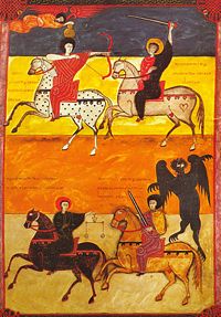
Spanish Illuminated Manuscript

Before I begin about the Spanish Illuminated Manuscripts, let me give you some backstory to what Illuminated manuscripts were. Illuminated manuscripts were hand written and hand drawn pages that were brightly colored, had terrific scenes, and were pressed with gold leafing, giving the page a bright feeling. This feeling helped give the manuscript its name due to the gold leaf "illuminating" the page, making it glow in the light. It was used from the beginning of the Roman Empire and spanned to the beginning of moveable type around 1450 A.D.

Now onto Spanish Illuminated Manuscripts. Spanish Illuminated Manuscripts began around 711 A.D. when the Morrish Army under the Arab governor of Tangier attacked the Straights of Gibraltar, destroying the Spanish Army. From there, the newly settled Morrish people took Islamic design and combined it with Christians traditions. The combination created a new design that could and would stand alone as one of the great periods in text and design.


File:B Facundus 191v.jpg

When it came to the actual design itself, the Spanish Illuminated Manuscripts had a unique design all its own. It used bold, intense color married to the use of geometrical design. It also used random shapes such as stars, rosettes, polygons, and garlands. The two major designers of the time were Florentius and Facundus. They both incorporated bold color along with textural designs that made their texts and pictures stand out.


Tuesday, February 9, 2010

After Class 2/8

Today's class brought a boat load worth of information. beginning with the origins of the alphabet. So far in my college career, this chapter has been the most stimulating and eye-opening chapter of reading I have read. To read how the words and the letters of our world were derived, beginning from the early Cretan, through Greek, onward to Latin, and arriving at our current English language, was just so interesting and unforgettable. We discussed how intricate each letter system was, being derived from either geometrical or mathematical reasoning.


Question of the day: In the Greek Alphabet, how and why the circles used to create certain letters. What is the importance of using circles and squares to create the letter?

Monday, February 8, 2010

Ch. 2 and 3 Summary

" Alphabetic writing became the mortar binding whole communities against limitations imposed by memory, time, and place"(Meggs 30).

The quote above truly stuck out in my head once I was done with the chapter 2. It is true in every single word written. Without the truly amazing invention that is the alphabet, the world would not be able to function today. Onward to the chapter. Chapter 2 covered the basis of how, why, when, and where the beginnings of the present-day alphabet began; starting with Cretan pictograms. The Cretan pictograms were formed to represent ideas and history that occurred during their time. These symbols represented different every-day things that were important to Cretan culture. Soon, these symbols slowly evolved into forms of the symbols' vocal words. For example, the ox, which was Aleph in cretan, slowly but sure evolved into the resemblance of the letter A. From there, the North Semitic alphabet


Fact of the post: Greek writers developed a style of writing called "boustrophedon" standing for "to plow a field with an ox". The writing style would begin from right to left, but once one had ended the line, they would begin reading from left to right on the very next line. This allowed the reader to continue all the way down the page without having to reset their eyes to read right to left. How cool is that?!?!? I wish it was still around. I bet reading books would become a lot faster.

Saturday, February 6, 2010

After Class 2/5

As I sat down in class today, still having the reading fresh in my mind, I was somewhat excited to go over what we all had read in the first chapter. I blew through that practice quiz like it was nothing, yet only got a 71% on it. Looks like I should highlight more. We started the actual discussion by creating a timeline on the board, trying to map out the beginning of both written and spoken language. Not only did we accomplish that, but we also learned something new from Laura about a new discovery that could set the beginning of symbols and ideographs back to about 3 million B.C. I sat there pondering about what the man/woman/it was trying to convey after looking at that picture. Possibly some kind of ritual? Or it very well could be something that deals with early math? Only time will tell what it could have possibly meant. I'm excited to find out. From there, we went over the beginnings of spoken language, then delving into the history of written text from very early to well known hieroglyphics from Egypt. Towards the end, the main focus was on the Rosetta Stone and cuneiform.

In my eyes, the most intriguing part about today's class was at the very end, under the subject of cuneiform. Cuneiform is the type of writing where symbols slowly but surely formed into more abstract symbols, and ultimately turning into letters. It was mind blowing to me that the symbol for and ox slowly but surely turned into the letter A. To see that list of the genealogy of symbols to letters really opened my eyes to how far written language has come. It is truly, in my eyes, the greatest invention to ever have occurred on this earth. Without it, almost every day tasks would be difficult, if not impossible.

Food for thought: Certain objects can be looked and drawn in certain ways, i.e. the ox. If it were depicted/drawn differently, then could the alphabet have changed totally? Would we have the same letters we have today? Ponder that one for a bit...

Wednesday, February 3, 2010

Ch. 1 Summary

Chapter 1 brought the beginnings of writing to forefront of the beginning of graphic design. From the beginning of man evolving from a hunched over creature, to a free-standing man, adaptation to the time at hand was crucial to the survival of man. Soon, extremely early forms of speech and writing had begun to be used to convey feelings, hunts, and ways to continue to survive in the vast world. A great quote was used that stuck out to me. "Until the electronic age, spoken words vanished without a trace, while written words remained"(Meggs 4). When you stop to think about it, words that are not written down almost disappear with every new breath. But thankfully for writing, some of those spoken words would never be forgotten. Once writing had begun to take form, civilizations soon began to record everything from crops to money, and whatever else occurred during their lifetime. Because of writing, those civilizations will be remembered for years to come.

When it came to actual visual communication, many drew back to the times of cave drawings, predominately in Africa and Europe. Most notably, (that also appeared in our first presentation) the Lascaux Cave in France seemed to depict a type of hunt in some way, possibly giving those who saw it valuable information about how to hunt and/or how to kill certain prey. But those were not the only interesting details of those cave drawings. The way that these prehistoric men/women created the cave drawings were an advancement in its own. The fact that they figured out how to create the pigments by using animal fat and different colors around them. From there, they were able to develop a type of communication that was pretty self explanatory. Pictographs were created from combining pictures and the earliest forms of words and sounds to try to create a readable language. From there, an explosion of writing occurred that spanned all over the world. Soon, a style of labeling and writing popped up in Mesopotamia. Their earliest form of labeling certain pots, crops, etc...was based on a number system that rooted from using a ten finger system. Because of this, life was made easier for the Mesopotamians. From there, other civilizations began to create their own style of writing. Most notably, the Egyptians. They created a picture-symbol type of writing that was given the name "hieroglyphics"(Greek for "sacred carving"). These hieroglyphics helped depict every day life in Egypt, ranging from God worship to yearly crop reports. The system could be read in any way, provided that they author gives a starting point to being reading from. Soon, rebus, a style of depiction that used the sounds of different objects to convey a sentence was widely used along with the hieroglyphics. Because of these advancements in writing, history was not only being made, but also made possible for future people like us to read, interpret, and learn.

Yes, there are words. There are spoken words between person to person. There are also written words to read. But how did they get there? Did they just magically appear on the page, clay pot, or stone? No way in hell. But that would be cool though. There were advancements in writing utensils and writing mediums. Early writing utensils were in the forms of stylus like reeds that were sharpened at the end to be able to carve deep impressions into the medium. Early mediums would differ from civilizations but the most popular early medium was clay. When wet, it was easily impressionable and permanent when the pieces of clay were dried/fired in a kiln. These were the most favored pair of writing utensils until the Egyptians came along and revolutionized writing in a way that could almost never be paralleled. They figured out that by taking strips from the Cyperus papyrus plant and laying them horizontally, then laying another layer on top perpendicular to the original layer, and pressing them together until they formed on unified sheet, they created one of the most important inventions every created; paper. After the creation of paper, not only did the medium of writing expand, but also the types of utensils expanded along with different types of inks, along with new, bold colors from the world around them. Because of their advancements in writing, communication between people all around the world has almost become an after thought. Without the beginnings of language and writing, the world would not be the world we live in today.


Fact of the reading: The Rosetta Stone, discovered in August of 1799, was one of the greatest archilogical finds ever. It had hieroglyphics, demotic, and Greek lettering, giving the history of Egypt and other civilizations.


After Class, 2/3

Today was a day full of introductions, play-doh, syllabus rambling, and the early beginnings of what should be a fun class. We started out with a different way of introducing ourselves. Rather than sit in a circle, sing camp fire songs, and roasting marshmallows (would be a fun way to spend my afternoon though), we fully immersed ourselves by just walking up to each other, saying our names, and arguing which state looks more like a hand, Wisconsin or Michigan. It was a nice change of pace from the normal, "Hi, my name is..., "My Major is...", etc...

From there, we went onto go over the syllabus and what to expect this semester. As I was sitting there listening to what we would be experiencing this semester, I was thinking about a quote that was said earlier in the class. The aspect that if I did not have a passion to learn in this class, then I might as well not be a graphic designer. I would have to say that I would agree with that statement. If you don't really have a passion to learn in this field, then you aren't made for this. I really can't wait to learn about the history that is graphic design, especially the Art Nouveau and Art Deco. This semester should not only be interesting and fun, but also eye-openeing. It's gonnnaaa beee fuuunnnn!!!!


Question of the post: What if there wasn't a history of GD. Would it just be like American or World history in the aspect that if none of us knew where we were, then would we all make the same mistakes/art styles in GD? Hmmmmmm... Chew on that one for a bit.